How Color Impacts Your Buyers First Impression
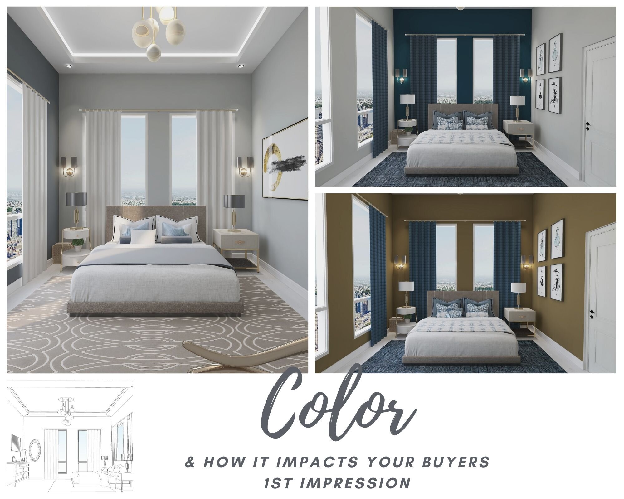
To demonstrate the impact color can have when showing a potential buyer a home, I have created three separate 3D Renderings, each using a different color concept while using the same floor plan, lighting and furniture.
Color can be one of the most important conversations you have with your clients, of course everything else matters too right down to the curb appeal. Once a client selects a color palette the mood has been set and everything else can fall into place more easily. With so many gorgeous colors to choose from, selecting the perfect color can be difficult and confusing.
With state of the art software, I can demonstrate to potential buyers and sellers using 2D and 3D rendered realistic photos what a room can look like just by changing the paint color.
Need help staging that home before it hits the market? I’ve also attached a corresponding Shop the Look Board for each rendering which helps the seller make quick easy decision to get that home staged and ready to sell.
Shop the Look is an easy way to update the space, using designer curated products that can be shopped for online. Shop the look is a great way to get the look of a designer, without hiring one.
Follow along as I demonstrate how to pick a color palette to set the mood for a room.
All of this is done completely virtual and ready to professionally present to your client within one to two weeks of contract, depending on the scope of services required, **call for a quote today 630.800.5720
https://www.adorndesigngroup.com/virtual-design-studio
Click here for more info on my virtual studio
Thanks for joining me and I hope you enjoy the presentation.

In the initial stages of the project the client will see both 2D and 3D renderings of the space layout and color concepts to get a feel of how the final space will show. This is where they will see in the final rendering the color that was selected and how it will show in a listing.
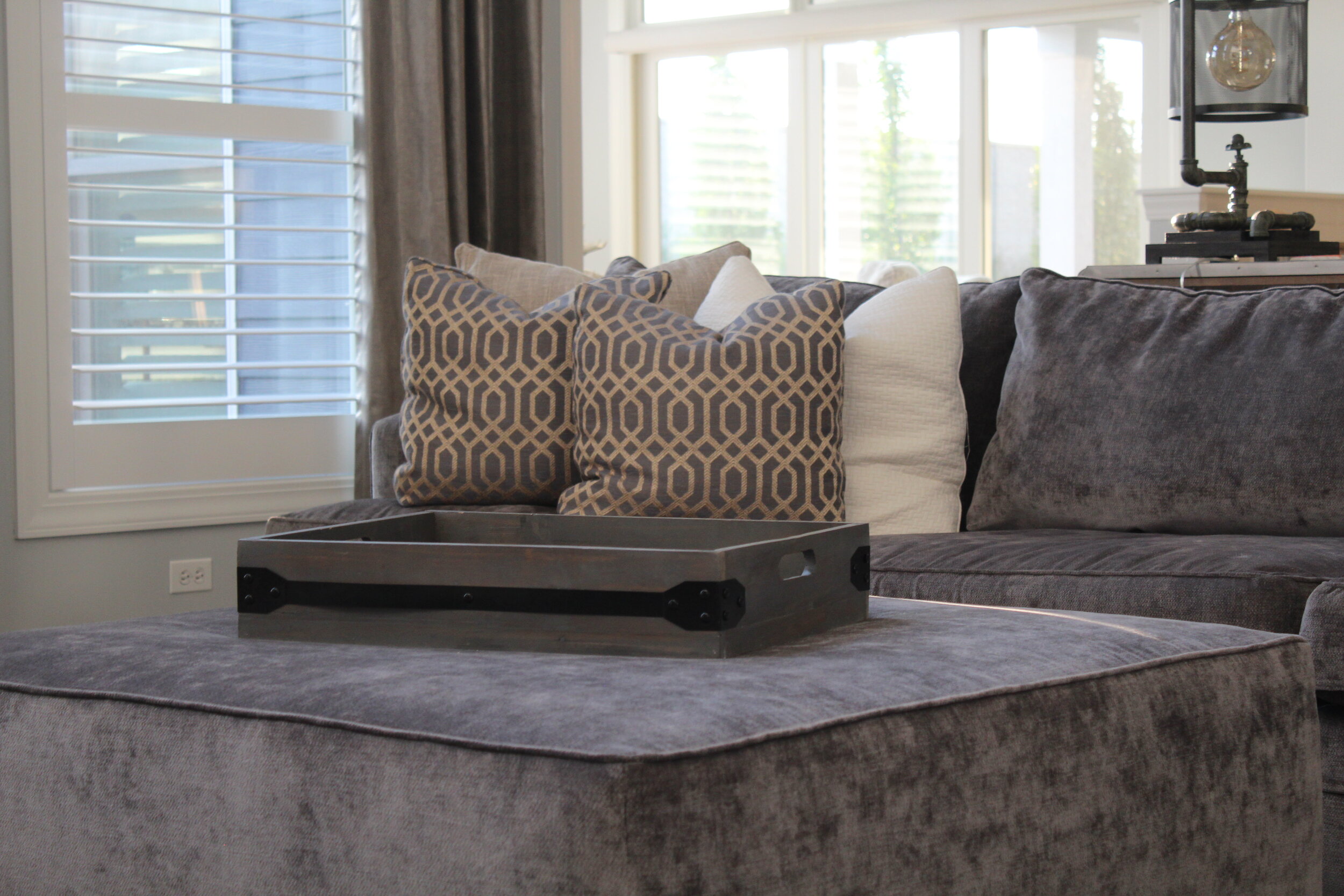
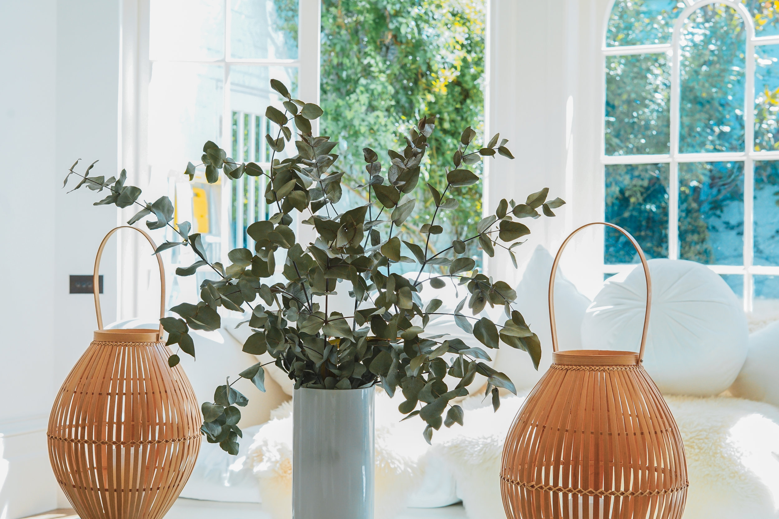
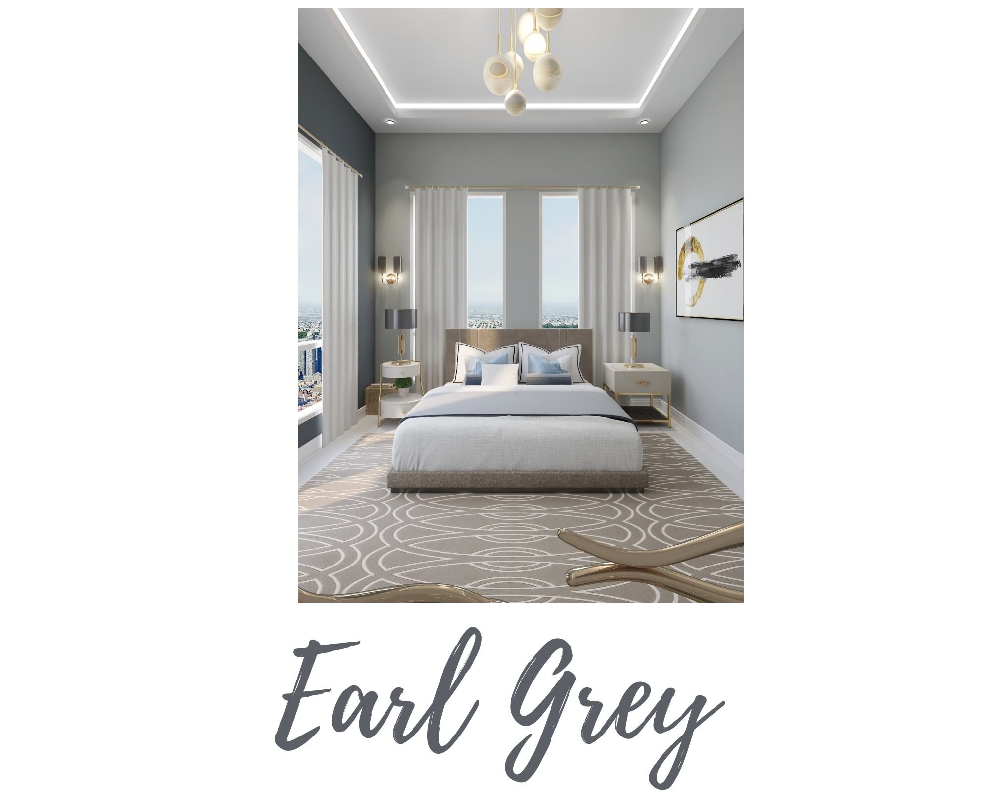
Grey and White. While often consider the “safe” color, white and grey tend to make a space feel fresh, pure and clean. If often makes sense to use this color palette as a go to for staging to give the space that clean uncluttered feeling. White also is the perfect backdrop to highlight furniture accessories and art work.

Shop The Look
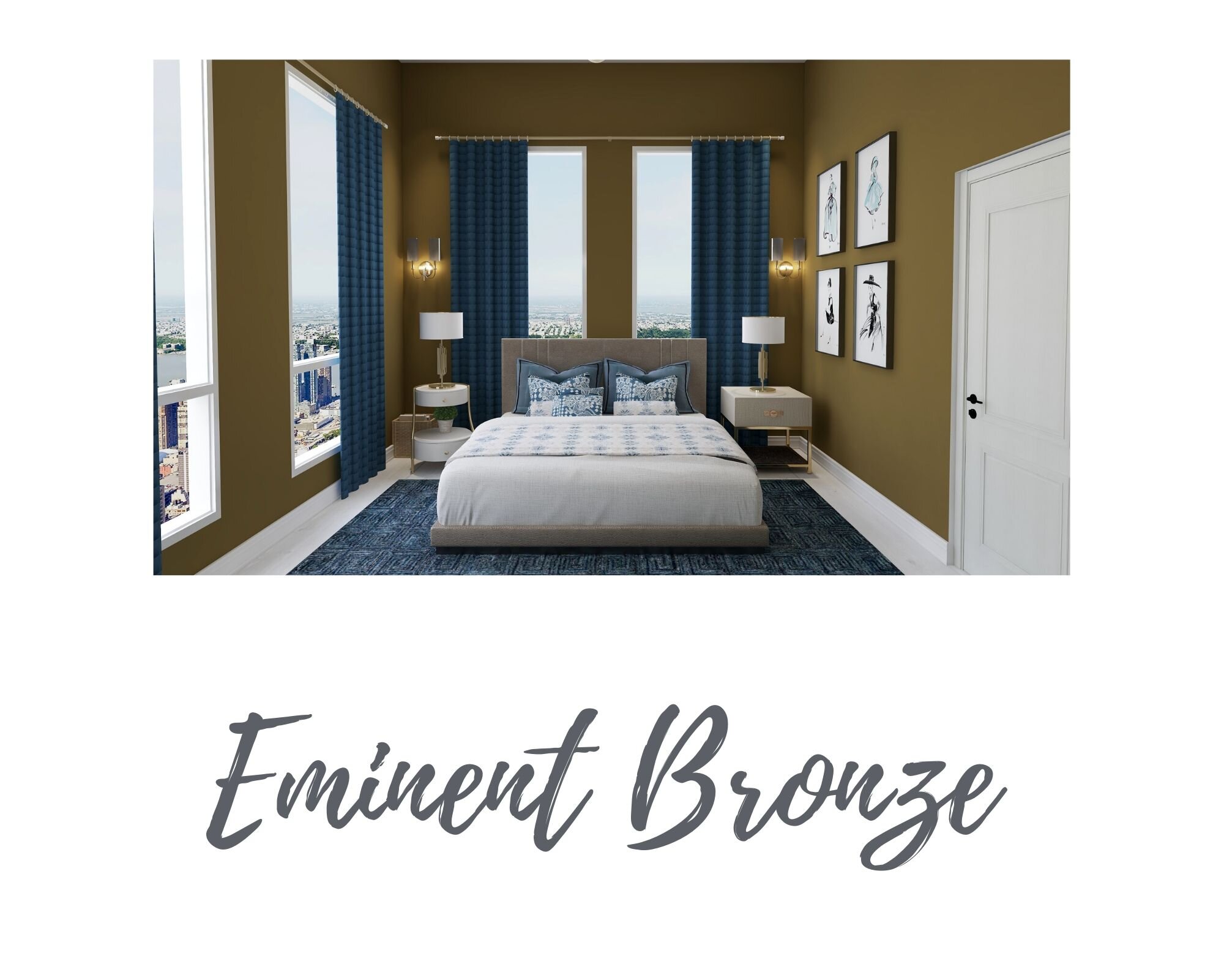
Eminent Bronze. Darker colors create a space that feels dramatic, formal and sophisticated. Darker color schemes are cozy and moody, however they are a bold choice and need proper consulting based on size and lighting location of the room.

Shop The Look
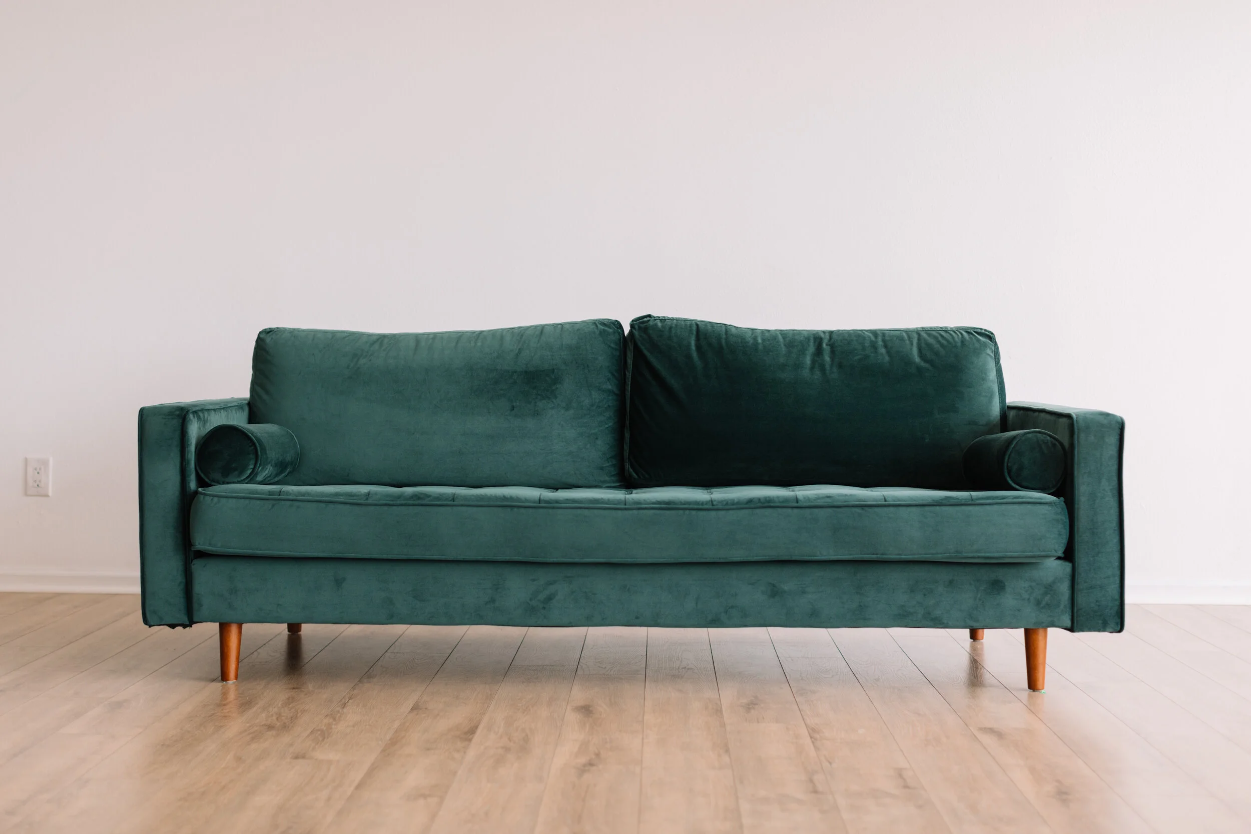
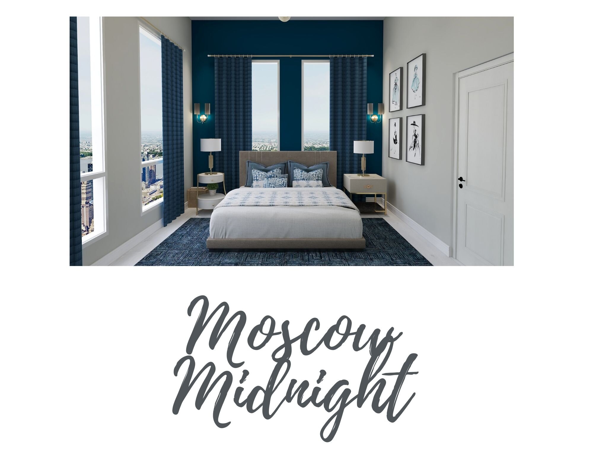
Moscow Midnight. Blue creates a peaceful, calm and inviting feeling to any room. Because blue is favored by so many people, it is often viewed as a non-threatening color that can seem conservative and traditional. Blue calls to mind feelings of calmness or serenity. It is often described as peaceful, tranquil, secure, and orderly. Blue is often seen as a sign of stability and reliability.

Shop The Look
If you’re ready to get started with your next client I’d love to help. For more information on all the interior design services I offer including virtual and full service interior design or to view past projects click on the link below. I’d also love for you to see my other blog posts and for us to connect on social media. Stop by my instagram link and let’s connect.
https://www.adorndesigngroup.com/
Oh and let me know which color you would choose by leaving me a note below?

Lets connect on Instagram

Additional Blog Posts