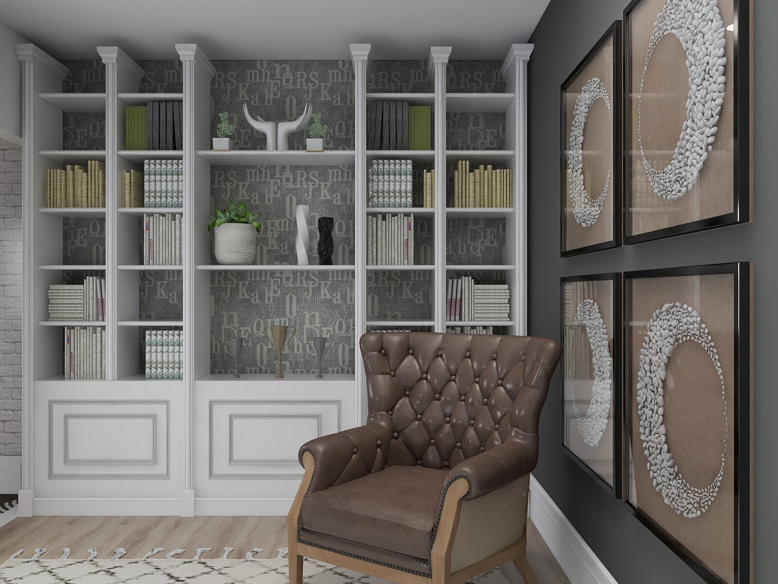
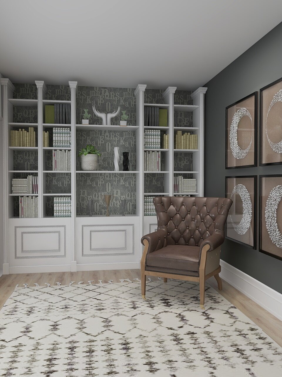
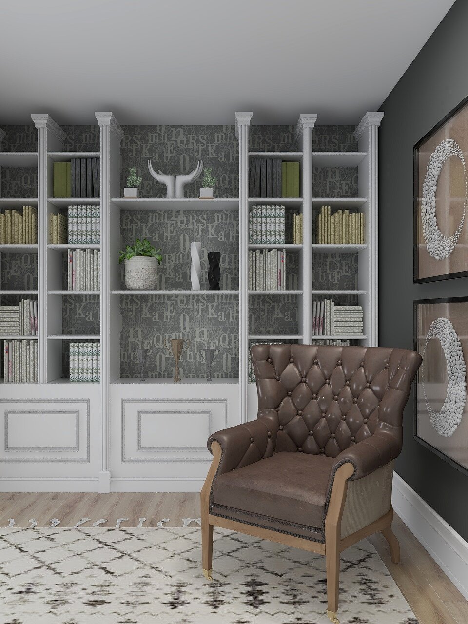
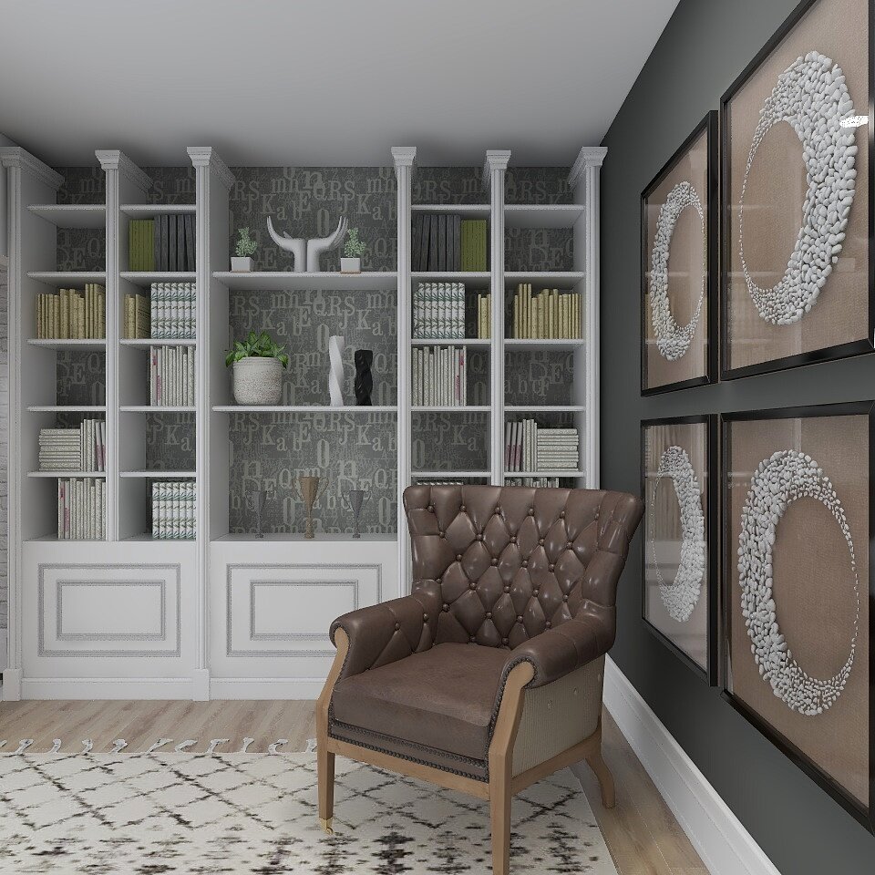
Almost every home I’ve ever design has that space! That little cove hidden somewhere in the corner of your home screaming Help Me!!
You know that junk drawer in your kitchen? Well bookshelves that are not given the proper attention can over time look like that junk drawer that needs a good cleaning out.
Here’s a few tips I’ve used over the years to give that wonderful but often overlooked space a makeover that works every time. If done properly that small wonder of a space could turn out to be a go to spot with a good book and a glass of wine! Lets begin.
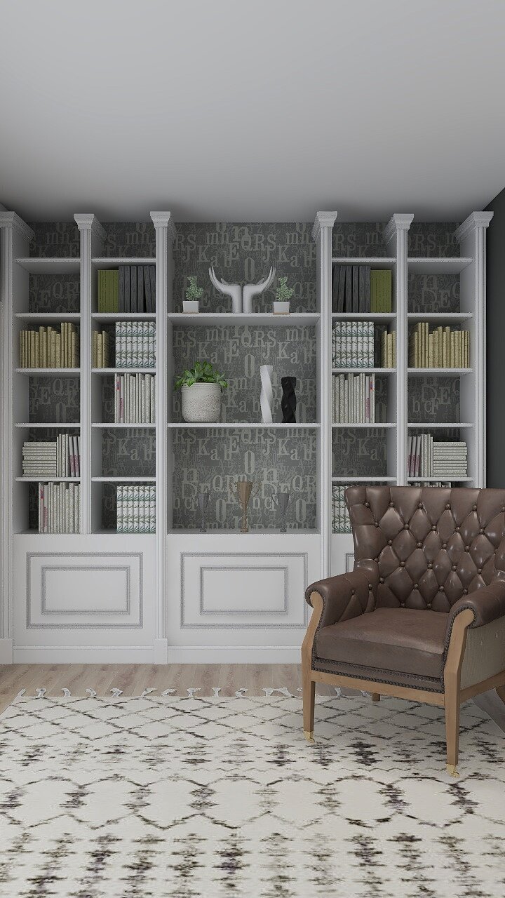
Start by choosing a color palette. Make sure your colors flow from one room to the next for a cohesive feeling as you move throughout the rooms. One of my all time favorite way to bring an often overlooked and boring shelf space to life is simply dressing up the back with a contrast paint color, fabric or wallpaper, yes wallpaper!!
Keep in mind this simple rule of thumb when styling a bookshelf. Take everything that is currently on the shelves off. For inventory purposes on any size shelving unit keep in mind this basic formula. ⅓ books, ⅓ accessories, and ⅓ empty space. Empty space gives way for some breathing room and helps to give the appearance of less cutter. We all need less clutter in our lives don’t we?
Step One: Find the right balance and choose a focal color, simple right?
Quick Tip:
One of the most frequent styling mistakes I see happen time and time again. To many small objects! Keep in simple.
Let’s talk hardcover books. Today most people are reading on their tablets, kindle (is that still a thing?) or laptops. What to do with all those oh so engaging hardcover books? Take the cover sleeve off for a more vintage look, they really are kind of vintage anyway right?
Don’t be afraid to stack your books. Vary the stacking go vertical and horizontal. Organize your shelves with 60% books vertical and 40% horizontal to create both balance and spontaneity.
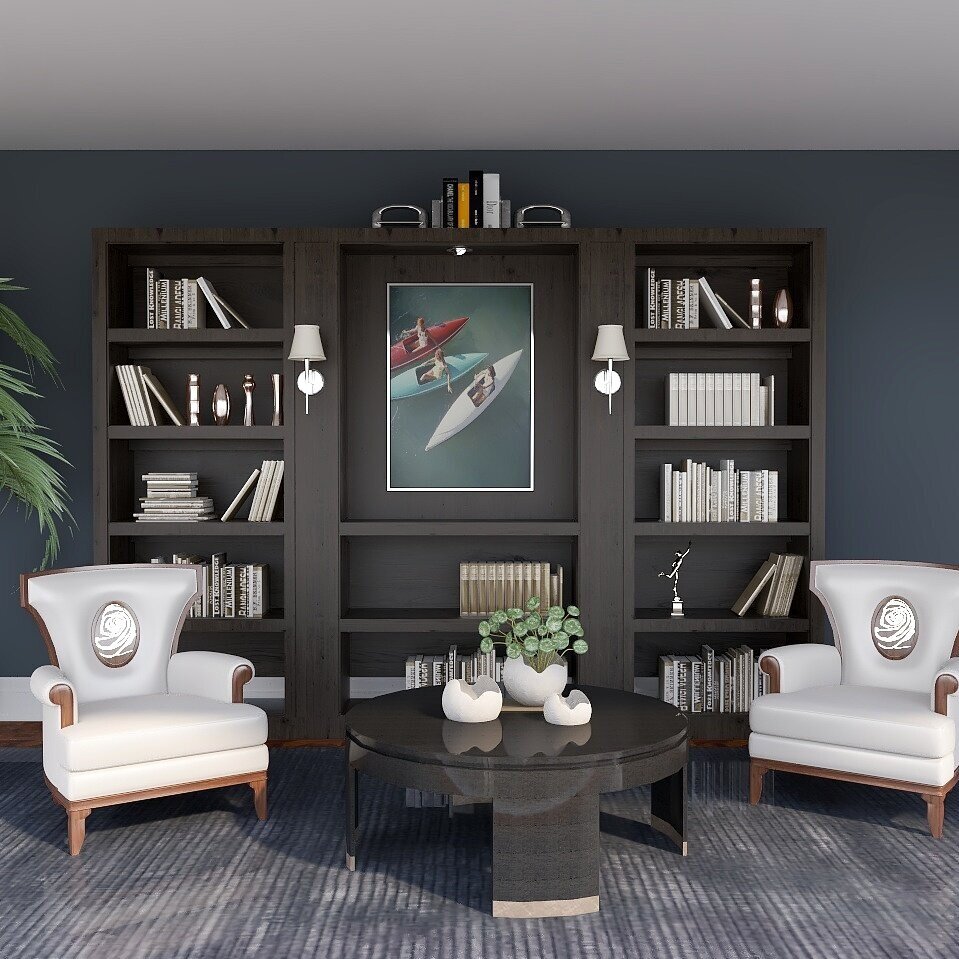
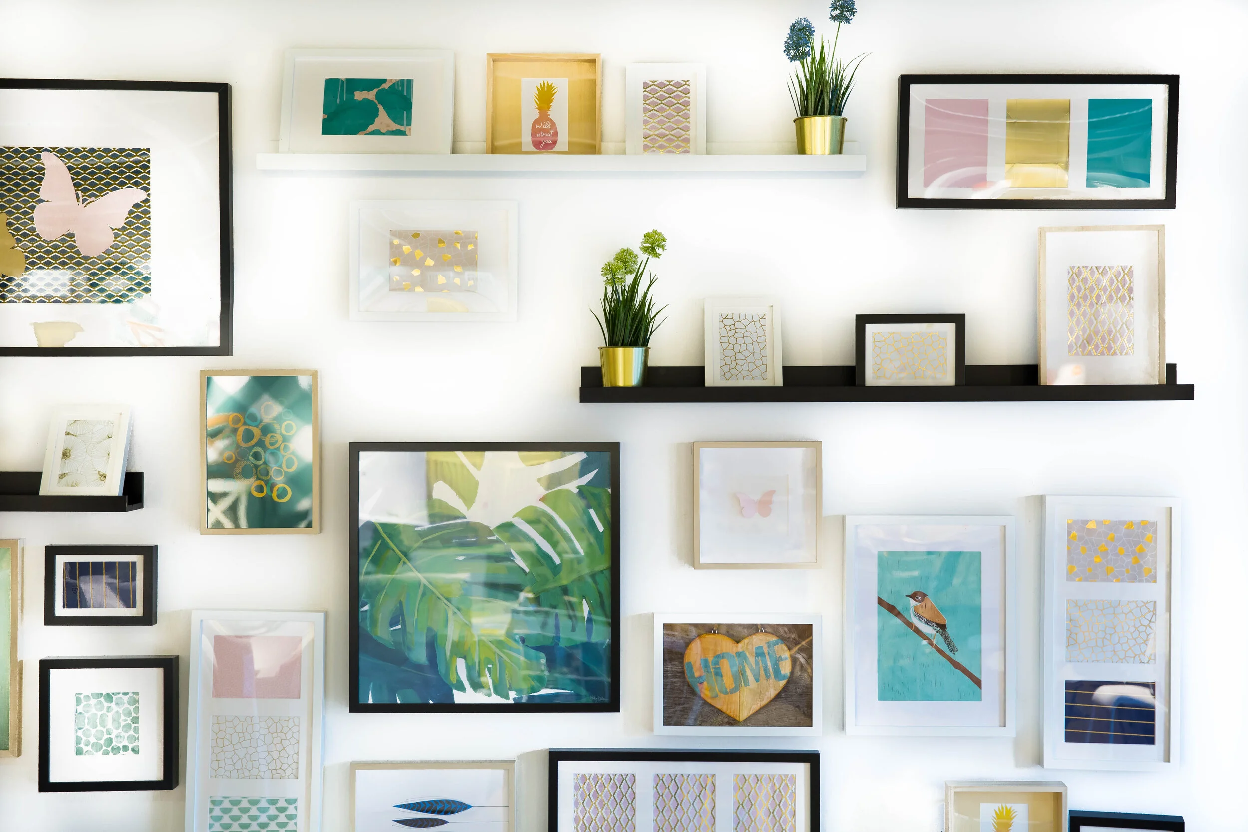
Have an awesome piece of art you want to show off? Make it the focal point by including it in the largest area of the unit.
Step Two: Go vintage with all the old hardcover books laying around and don’t forget the rule of thumb for stacking. Layer, layer and then layer some more. Don’t forget to add some art. Step back and take a look.
Quick Tip:
Don’t forget to create little vignettes with the ⅓ accessories and always shop your home first, you never know what might look great in a different space with a different perspective.
Make your books the focal point. Books have the ability to convey the personality of the owner. Show off all that knowledge.
So now let’s talk accessories. Place a few small pieces near the front to give all those books some depth and don’t forget to add in a pop of greenery now and then. For me it’s a personal preference but I choose not to include family photos in bookshelf vignettes. Bookshelves if done properly add to the room a feeling of art or architectural appeal.
So now your ready to clear out that clutter, dust off those shelves and begin again. Lets recap to keep it simple.
Create a backdrop with a pop of color. Go vertical and horizontal and throw in some vintage. Keep it simple and small object to a minimum. Layer, layer and layer again. Everything good happens in threes, and don’t forget to add in some greenery and show off that art pieces you found on vacation that you just can’t live without.
Hope you enjoyed my blog. Feel free to leave a comment below or just call to ask a question. Don’t forget to sign up for my newsletters for monthly design tips and inspirations.
All shelves styled in this blog are designed by Shelley Amato of Adorn Design Group. All rights reserved.
Shelley currently lives in the western suburbs of Chicago,Il with her husband three kids and two dogs.
To view her projects click on the link below for more details.
http://www.adorndesigngroup.com
For links to some of the products listed, Shop This Look


